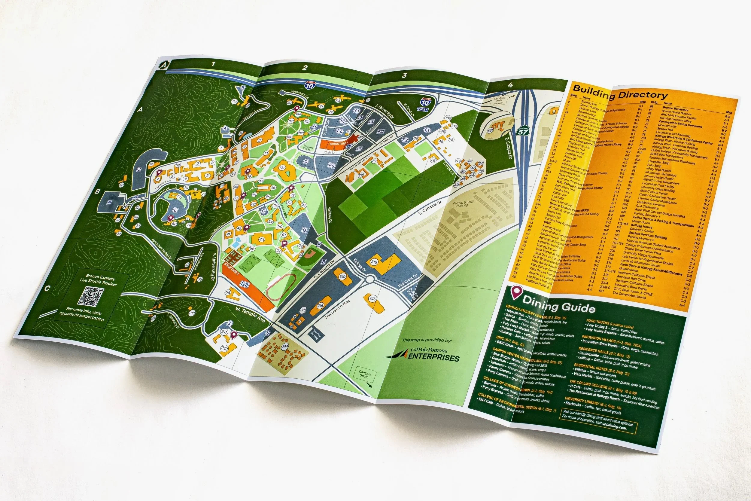
Campus Map Redesign
Overview
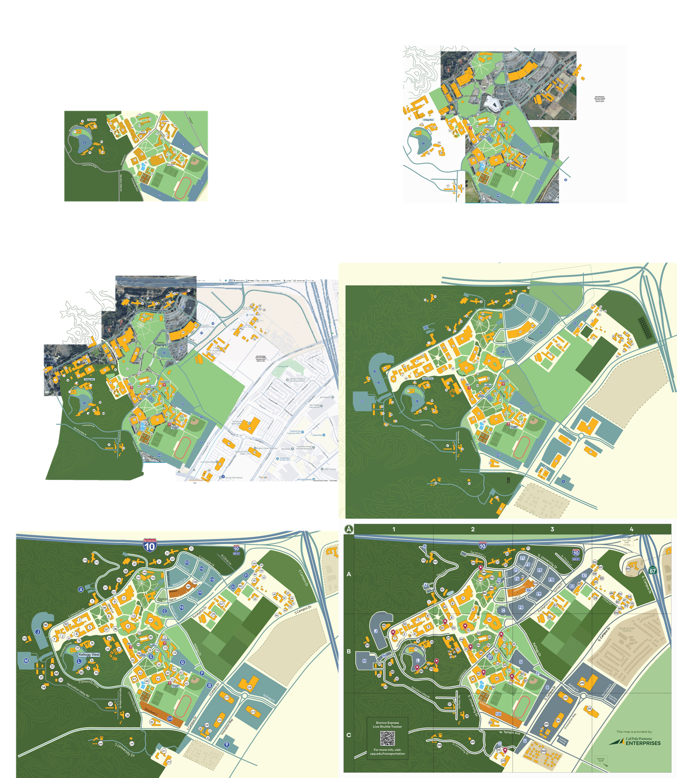
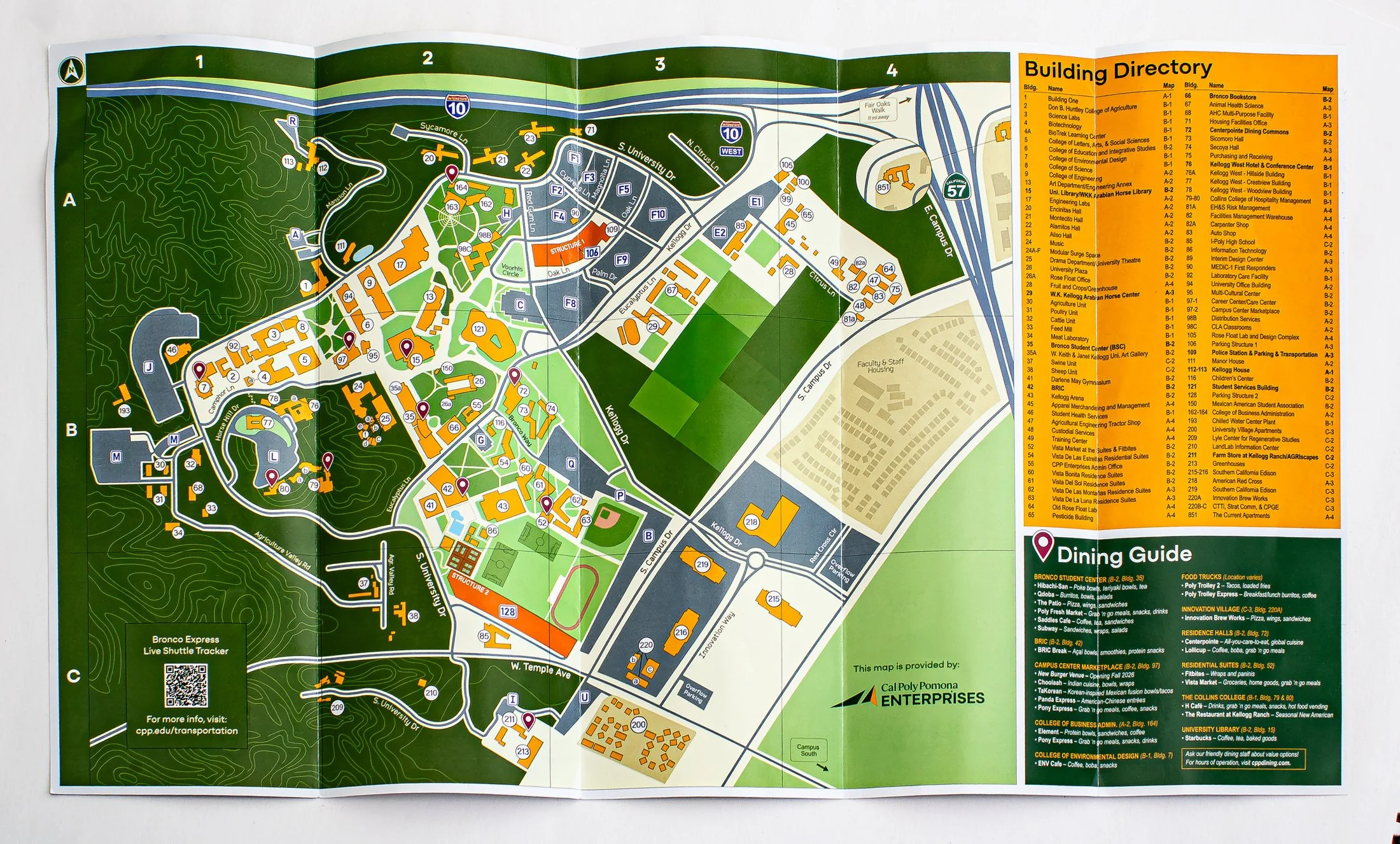
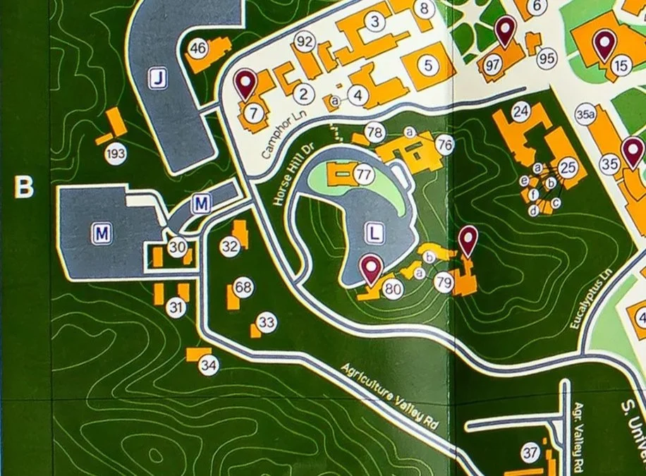
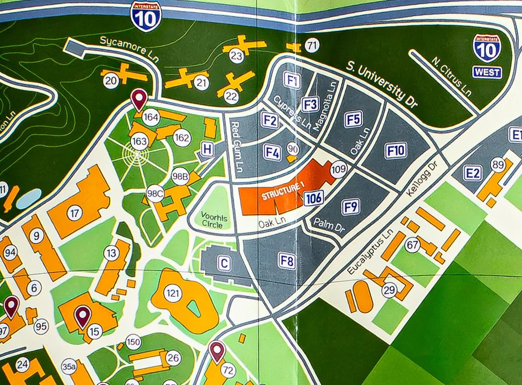
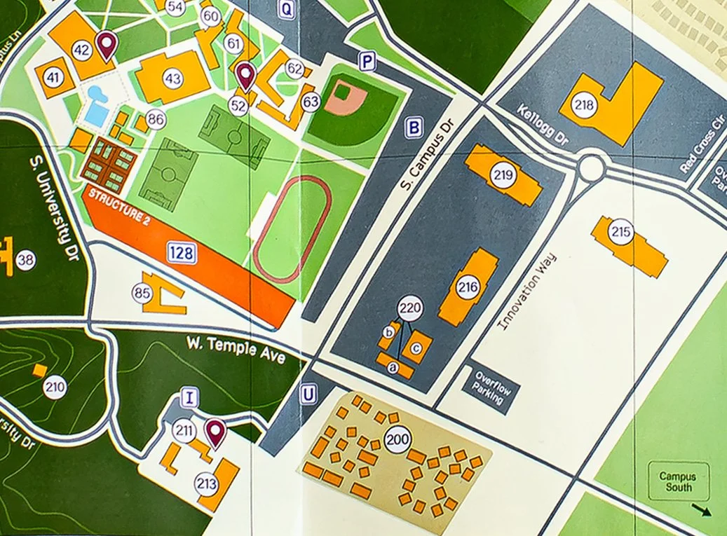
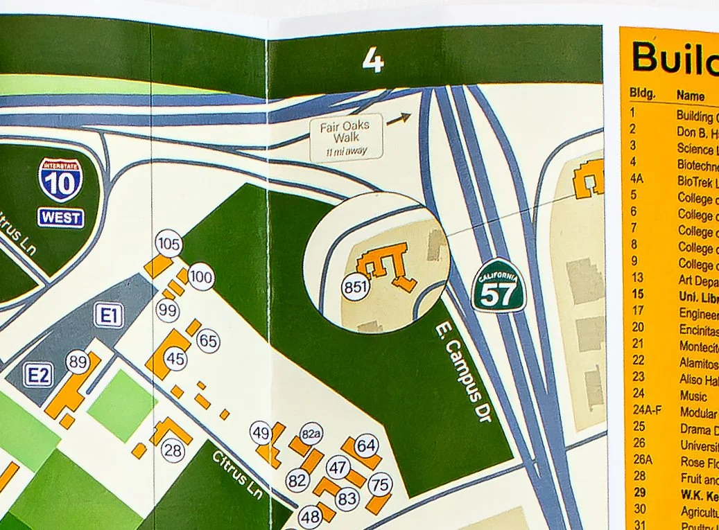
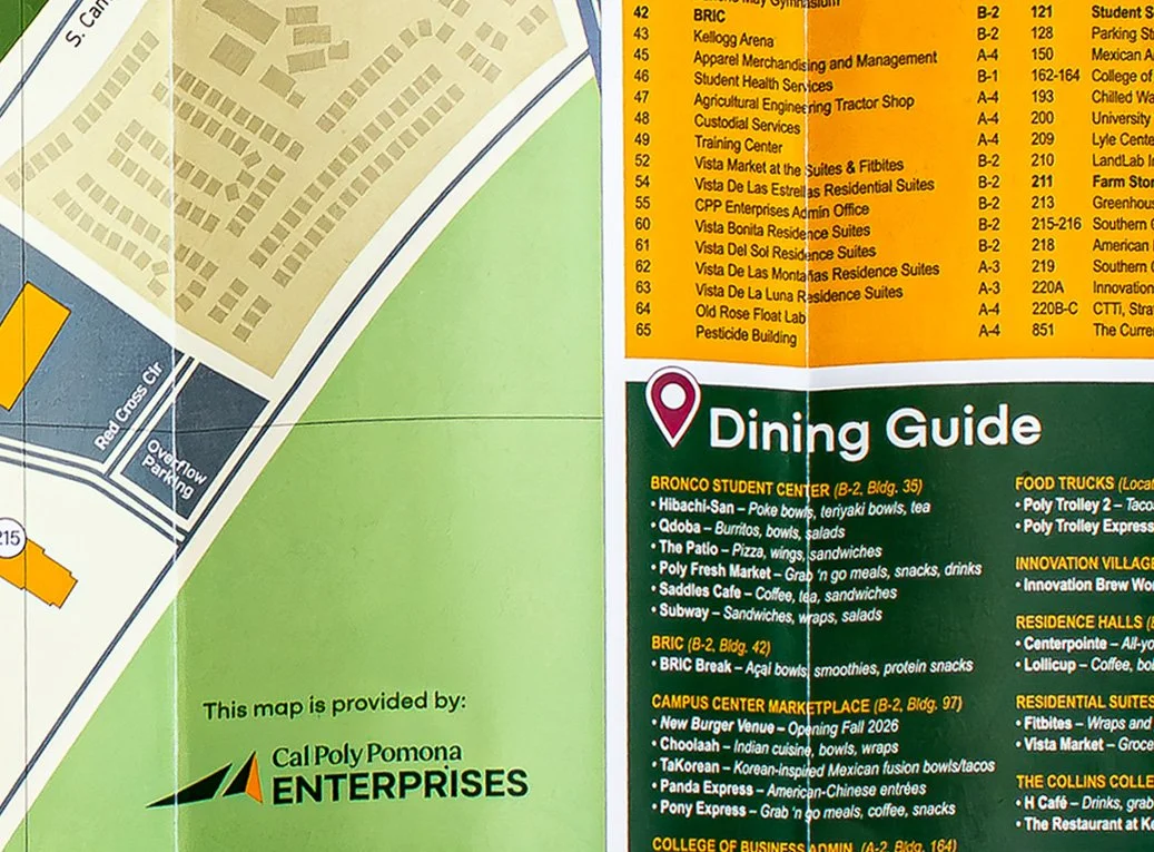
The Cal Poly Pomona campus map was redesigned to improve navigation, readability, and visual consistency while accommodating campus growth and new building developments. Drawing inspiration from familiar mobile mapping applications, the design adopts a contemporary visual language that students already associate with everyday navigation. Clear visual hierarchy, simplified road networks, and distinct color coding help users quickly identify buildings, parking areas, pedestrian routes, and green spaces.
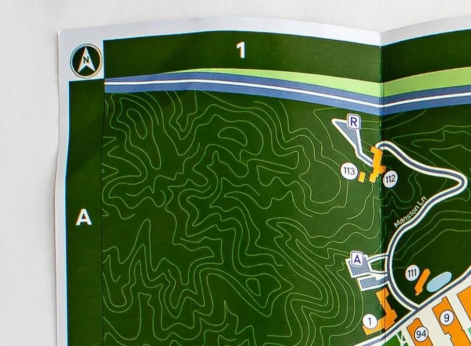
To reflect the university's unique landscape, I incorporated topographic elements developed from campus land survey data, using accurate elevation information to create contour lines that communicate the natural terrain. These details add depth and a sense of place while connecting the map's visual identity to the campus's distinctive geography. The final design balances geographic accuracy with approachable information design, creating a practical navigation tool that feels both modern and distinctly Cal Poly Pomona.
Deliverables
Map Design
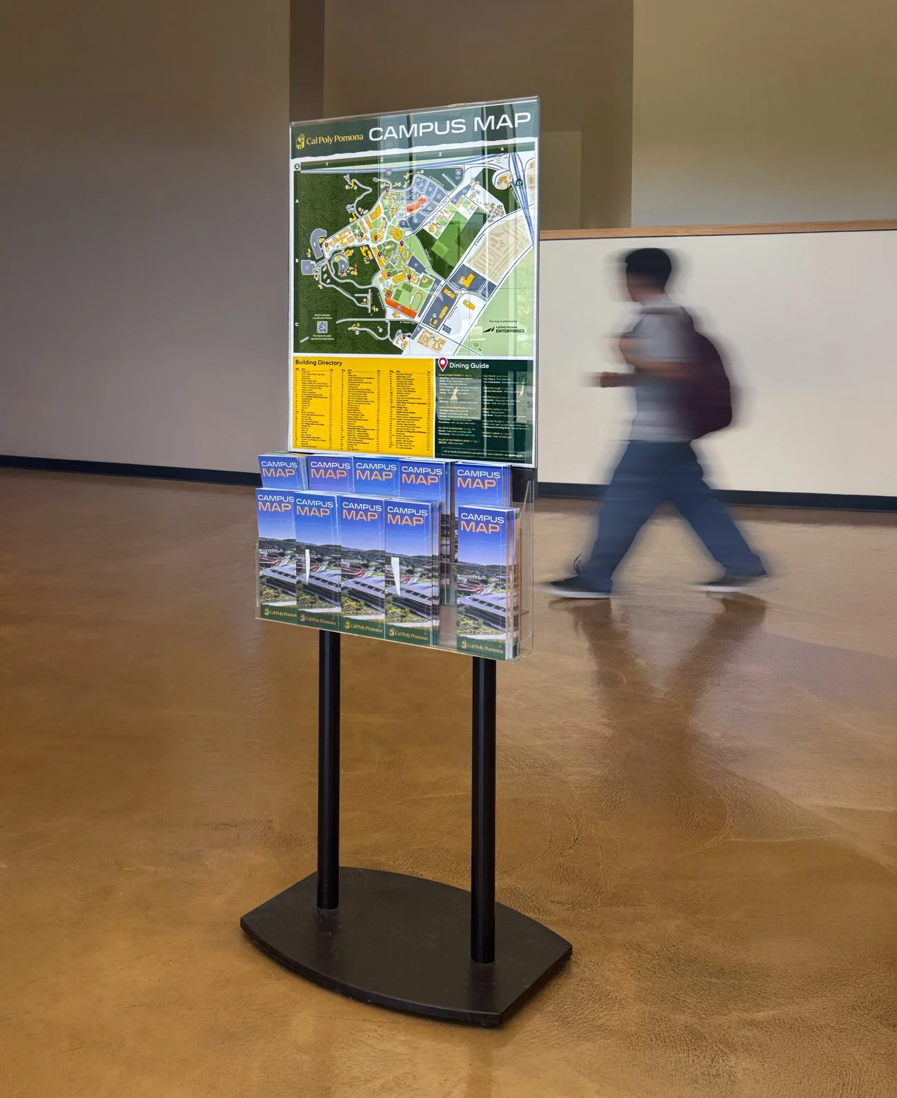
Wayfinding Signage
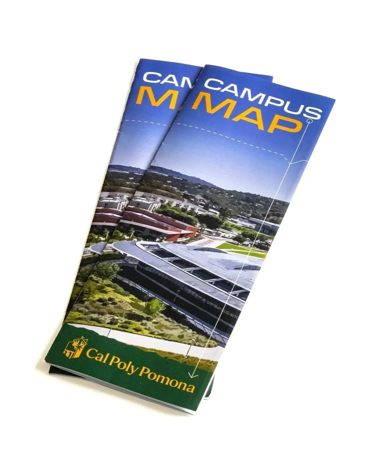
Brochure Design
Print Advertisements
Detail Photos
This project was submitted on behalf of Cal Poly Pomona Enterprises to the Association of Marketing and Communication Professionals in the MarCom Awards’ brochure category. Award results are expected in mid-fall of 2026.